Yiayias Little Kitchen
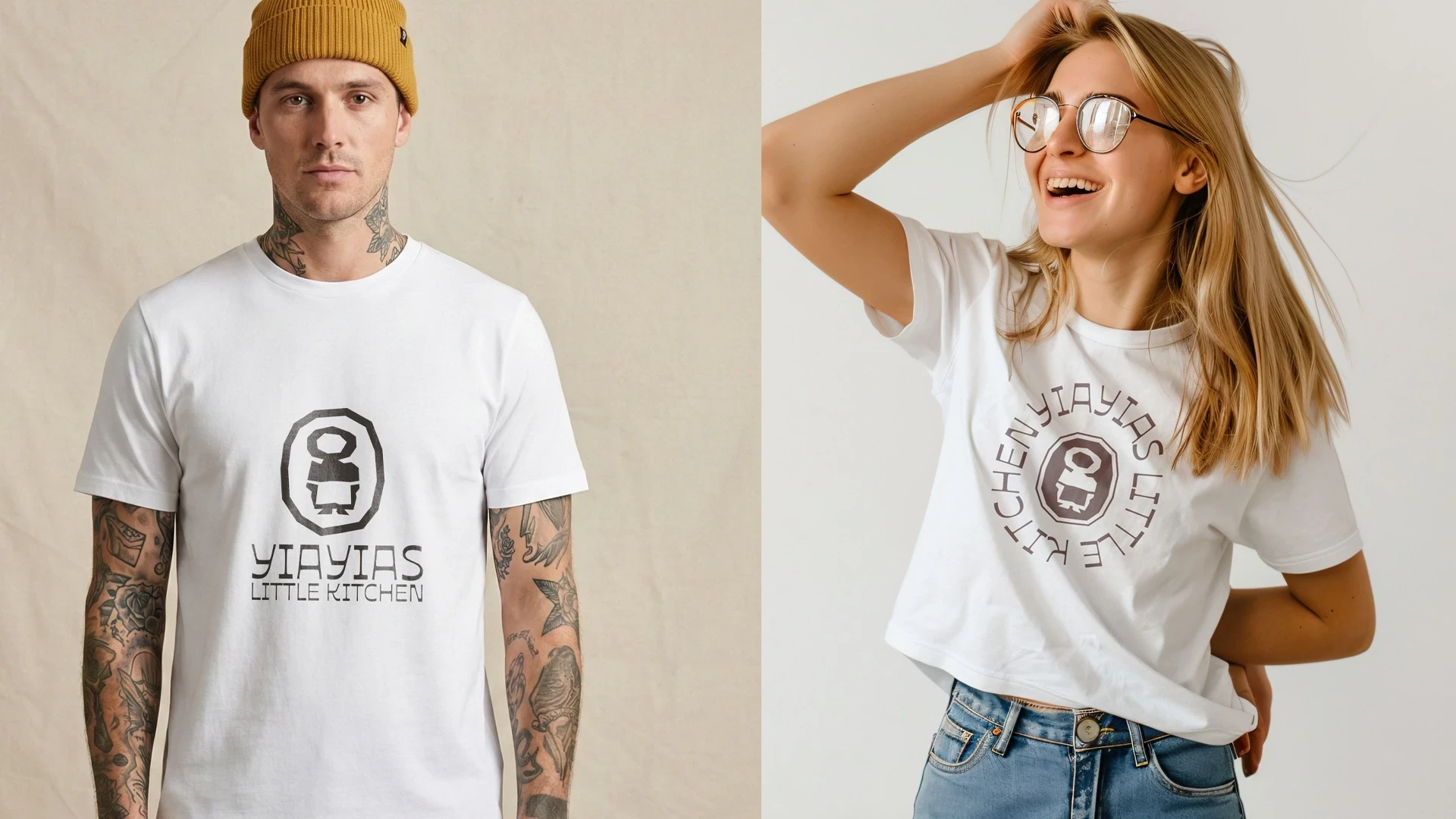
Yiayias Little Kitchen is a new, delicious Greek restaurant and takeaway in the beautiful city of Inverness in the Scottish Highlands. As the business grew, the brand also needed to grow with it: something that still felt like a family kitchen, but could carry the weight of a proper restaurant. Elegance had to mix with tradition, and the new brand identity needed to let clientele experience the smells and flavours of the Greek dishes served at the restaurant. We built a full identity system, new logo, colour palette, and typography, designed to take Yiayias from takeaway counter to dining room without losing what made it feel personal in the first place.
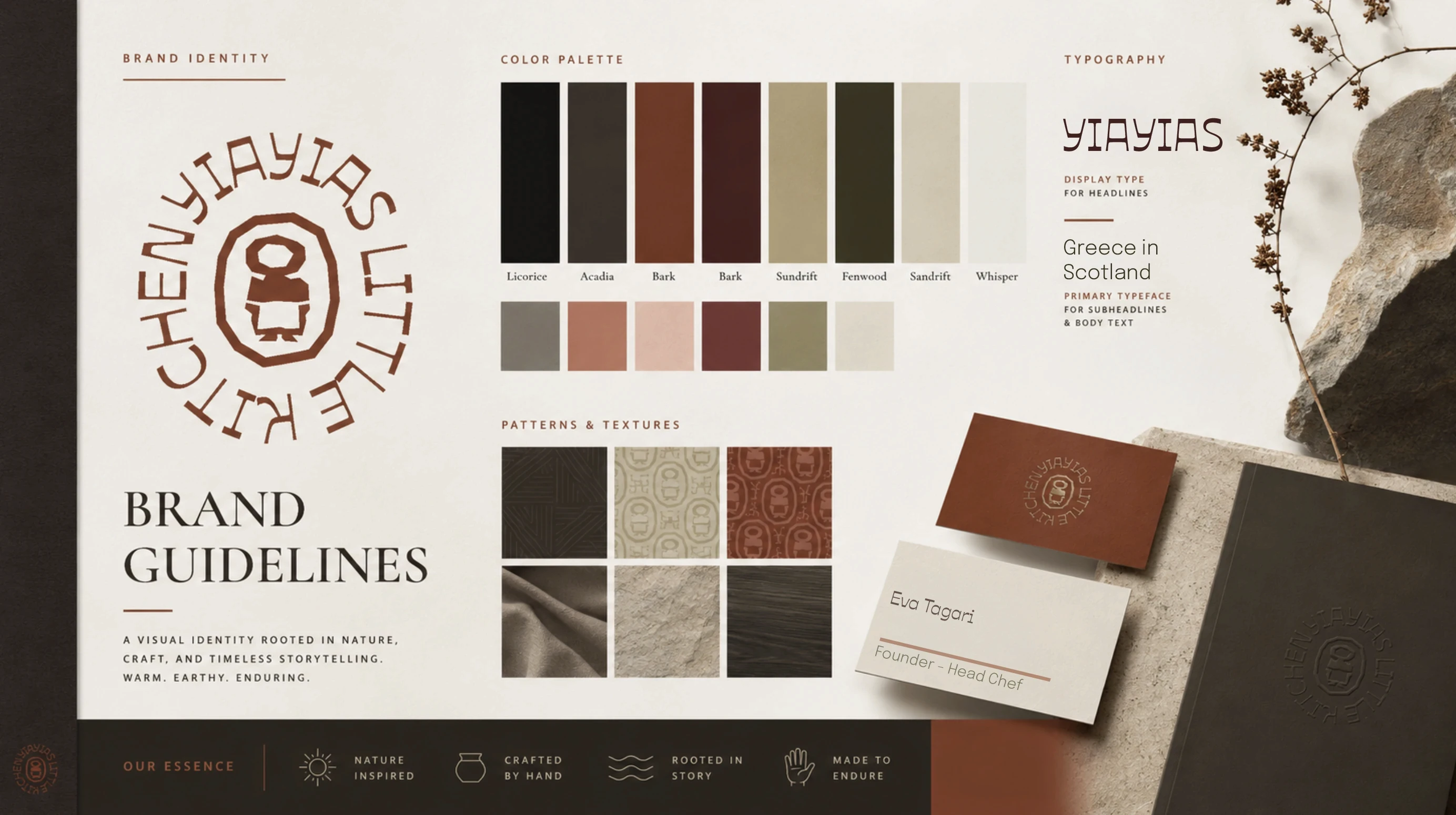
Working out what “authentic” actually needs to look like
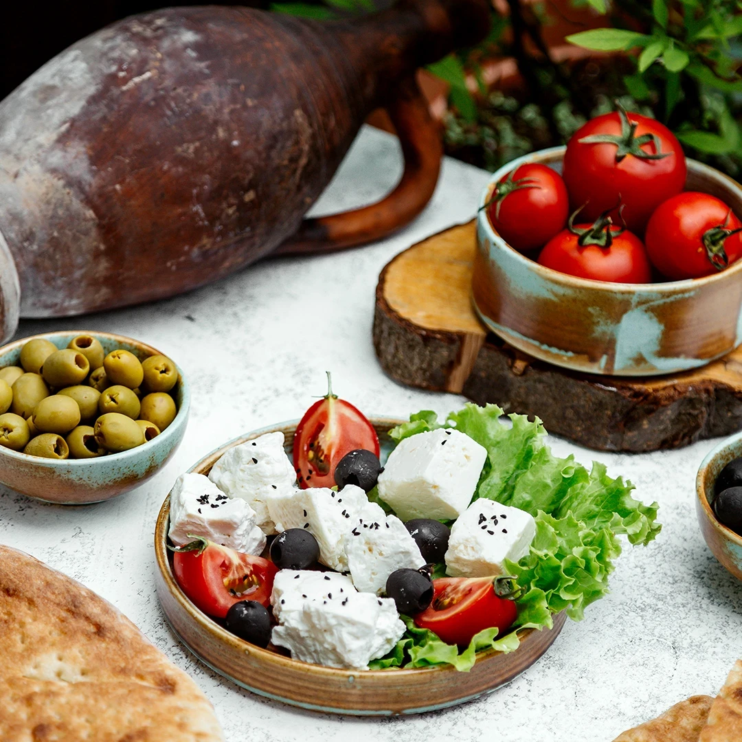
Greek food branding has a lot of clichés to fall into: white and blue, olive branches, stock Mediterranean imagery that could belong to any taverna anywhere. Before any design work started, we looked at what would actually read as authentic and personal rather than borrowed, drawing on real Greek tradition rather than tourist-brochure shorthand, since this was set to become Inverness's first genuine Greek restaurant, not just another takeaway with a Greek flag on the sign.
Designing an identity built to grow with the business
At the point we started, Yiayias was a small, single-location takeaway operation. But the brand needed to work for where the business was heading, not just where it was that week. That meant building a flexible identity system from the outset: one strong enough to carry the brand across markets, pop-ups, delivery, and social marketing as the business expanded its reach, rather than a one-off rebrand that would need redoing the moment the business grew past it.
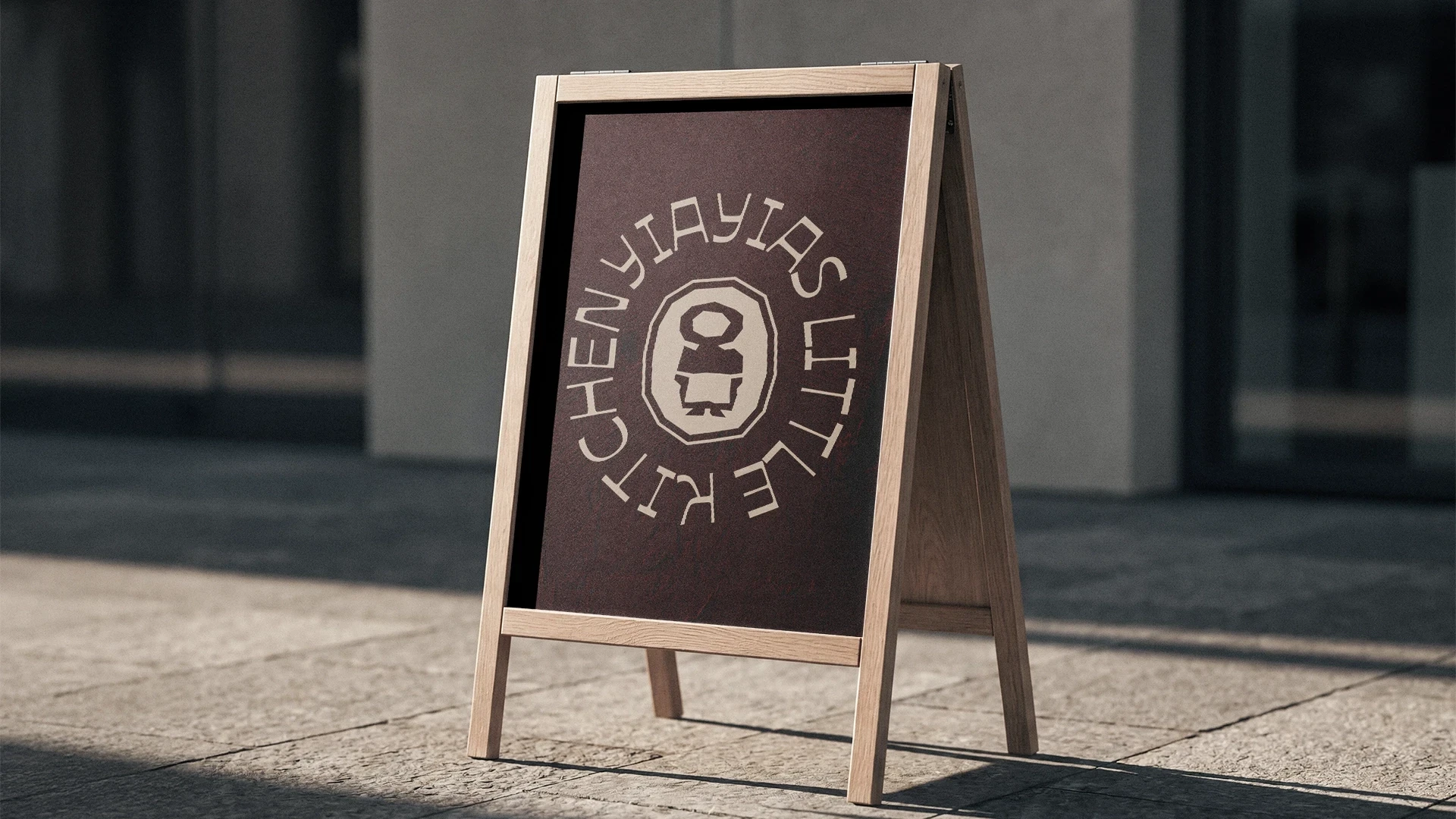
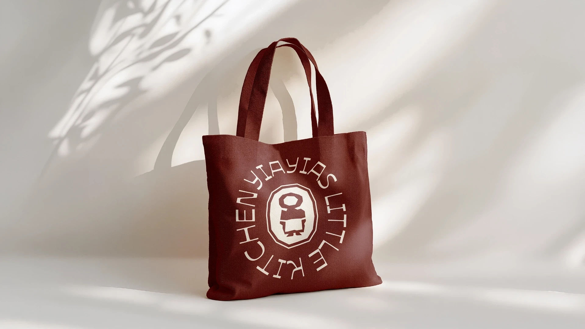
A logo and colour palette rooted in real tradition
We designed a new logo and a full visual identity built around warmth, craft, and genuine Greek heritage rather than tourist cliché. The colour palette draws on terracotta, deep burgundy, and olive, tones pulled from Greek pottery, produce, and landscape rather than a generic blue-and-white postcard palette, paired with typography chosen to feel handcrafted and personal without tipping into kitsch.
A system built to work everywhere the brand shows up
Beyond the logo itself, we built out the wider identity system, application across packaging, takeaway materials, signage, and social presence, so the same considered, warm identity shows up whether someone's picking up a takeaway order or walking into the new restaurant for the first time. Every piece was designed to hold together as one brand, not a collection of separate decisions made project by project.

Beyond the logo itself, we built out the wider identity system, application across packaging, takeaway materials, signage, and social presence, so the same considered, warm identity shows up whether someone's picking up a takeaway order or walking into the new restaurant for the first time. Every piece was designed to hold together as one brand, not a collection of separate decisions made project by project.